Resource Management Platform
Resource Management Platform
Resource Management Platform
A navigation and filtering solution for a multi-product content platform serving thousands of districts nationwide.
A navigation and filtering solution for a multi-product content platform serving thousands of districts nationwide.

Benchmark currently consists of over 2,000 resources and learning materials accessed by thousands of districts and administrators through their respective subscription package.
The Resource Library was designed to allow users to organize materials, share curated resources with colleagues, create bookshelves, and assign content to students all within one streamlined environment. However, as the number of resources available grew the legacy library did not make discoverability of this content easy.
Role
Lead UX/UI Designer
Lead UX/UI Designer
Lead UX/UI Designer
Duration
2025 ~ 2026 (7 months)
2025 ~ 2026 (7 months)
2025 ~ 2026 (7 months)
Lead designer
Defined information architecture, created wireframes, mockups, prototypes, and collaborated with other designers, product managers, and engineering on workflow optimization.
Research
Conducted competitive audits, market research, and help desk ticket analysis to identify user pain points and drive product roadmap prioritization.
Compliance
Designed to meet WCAG accessibility standards, Section 508, and FERPA regulations, including scoping individual student assignment visibility to teachers and students only.
Workshops
Led and contributed to team workshops to gather inspiration, feature ideation, and align roadmap prioritization.
[Highlights]
[Highlights]
[Highlights]
40%
40%
Reduction in clicks to locate resources
Reduction in clicks to locate resources
Reduction in clicks to locate resources
35%
35%
Improvement in task completion
Improvement in task completion
Improvement in task completion
5
5
Components adopted platform-wide
Components adopted platform-wide
Components adopted platform-wide
[The Challenge]
[The Challenge]
[The Challenge]
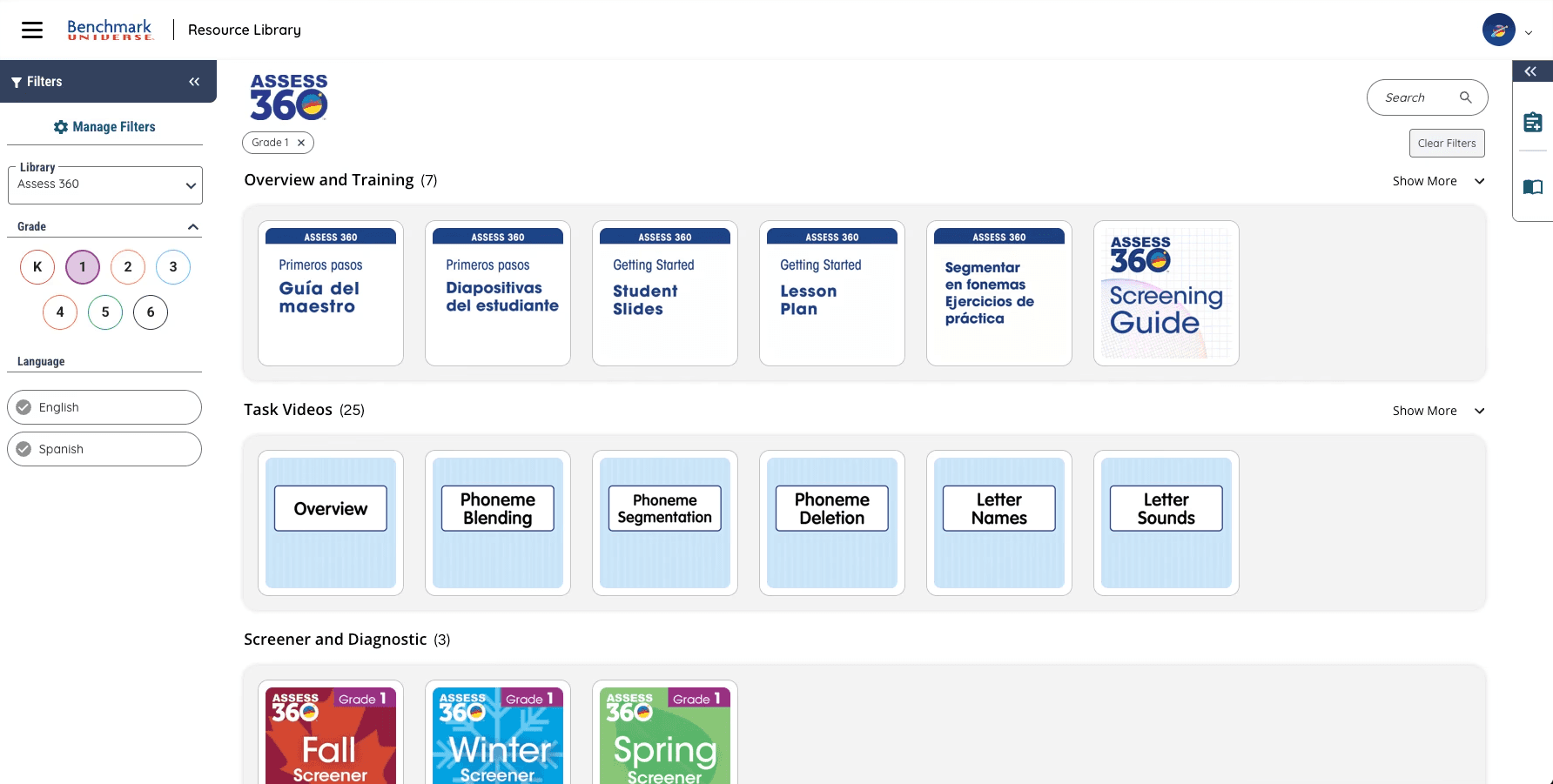
The existing resource library was built on a fragmented experience and legacy infrastructure, making it difficult for users to search, access, and share the content they needed. Since it supports workflows across the platform, friction here affects the broader user experience.
Users could only view materials by individual program, restricting cross-program exploration and creating an inconsistent filtering and search experience. Paired with unclear headings and no visual hierarchy, even simple tasks were difficult to complete.

The resource library sits at the center of the platform, with changes having downstream implications across assignments, bookshelves, and lesson planning.
The resource library sits at the center of the platform, with changes having downstream implications across assignments, bookshelves, and lesson planning.
The resource library sits at the center of the platform, with changes having downstream implications across assignments, bookshelves, and lesson planning.

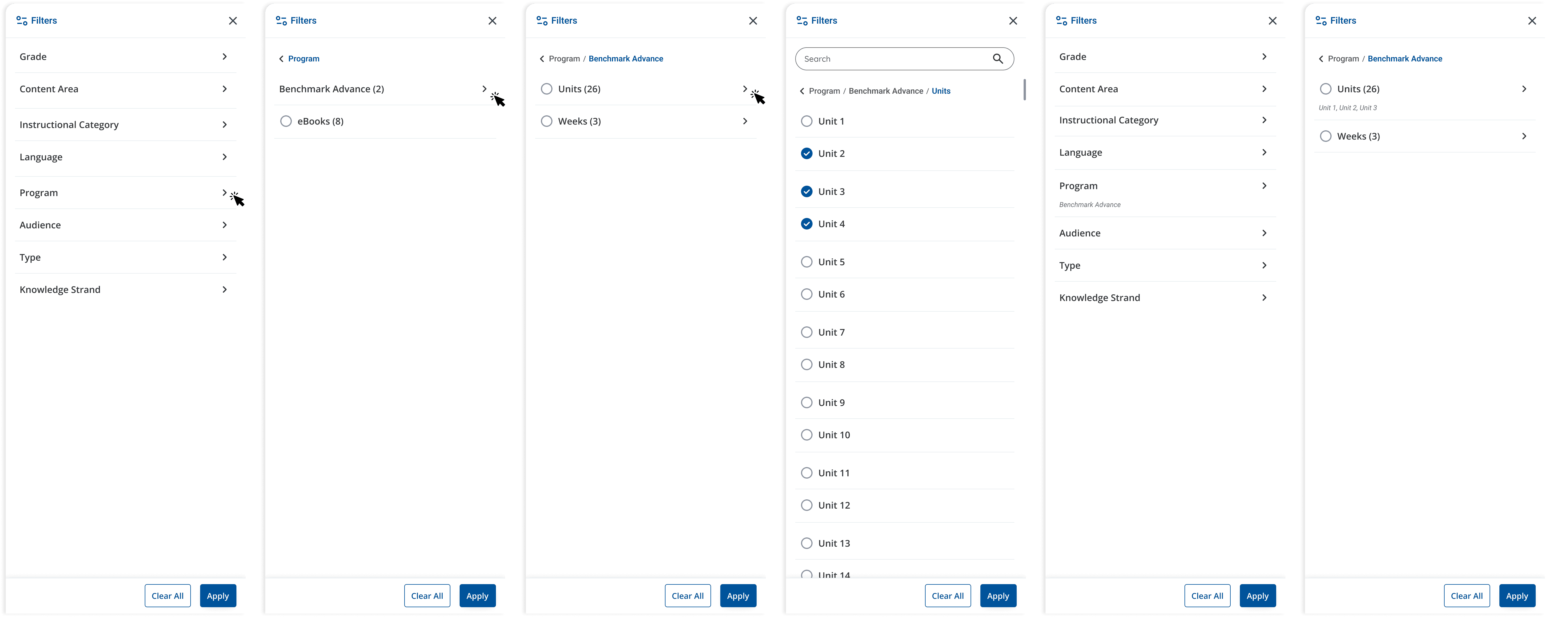
The existing library fragmented filtering across a sidebar and a separate modal, creating a disjointed and cognitively demanding experience.
The existing library fragmented filtering across a sidebar and a separate modal, creating a disjointed and cognitively demanding experience.
The existing library fragmented filtering across a sidebar and a separate modal, creating a disjointed and cognitively demanding experience.
[The Solution]
[The Solution]
[The Solution]
Due to time constraints and lack of resources a MVP approach was created to push out the main key components for this initial launch: a landing page with first time and returning user states, a results page, a favorited page, and a zero state.
Each page would allow the user to eliminate navigation barriers and improve cross-program discoverability through a new scalable filtering framework, enhanced search capabilities, and clearer content hierarchy.
In parallel, I established a set of new and reusable components that were contributed to the broader design system, ensuring visual consistency across the platform.
[Exploration & Brainstorming]
[Exploration & Brainstorming]
[Exploration & Brainstorming]
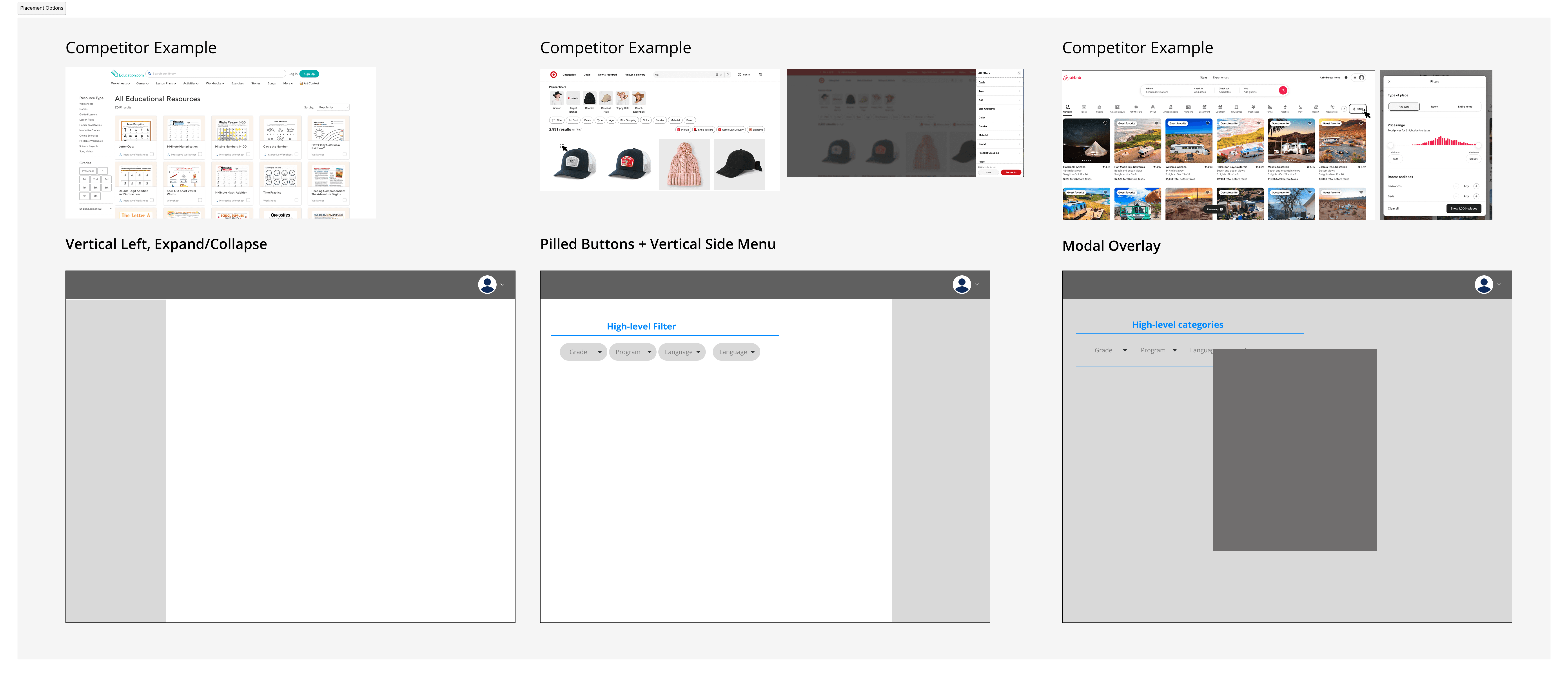
To understand the problem, we analyzed help desk tickets to identify recurring pain points, and conducted a competitor analysis focusing on filter placement, landing page structure, and content discovery patterns.
This research and pain points mentioned by users pointed to two consistent findings, users needed cross-program visibility, and filtering needed to be prominent earlier in the experience.
[First Time & Returning Users]
[First Time & Returning Users]
[First Time & Returning Users]
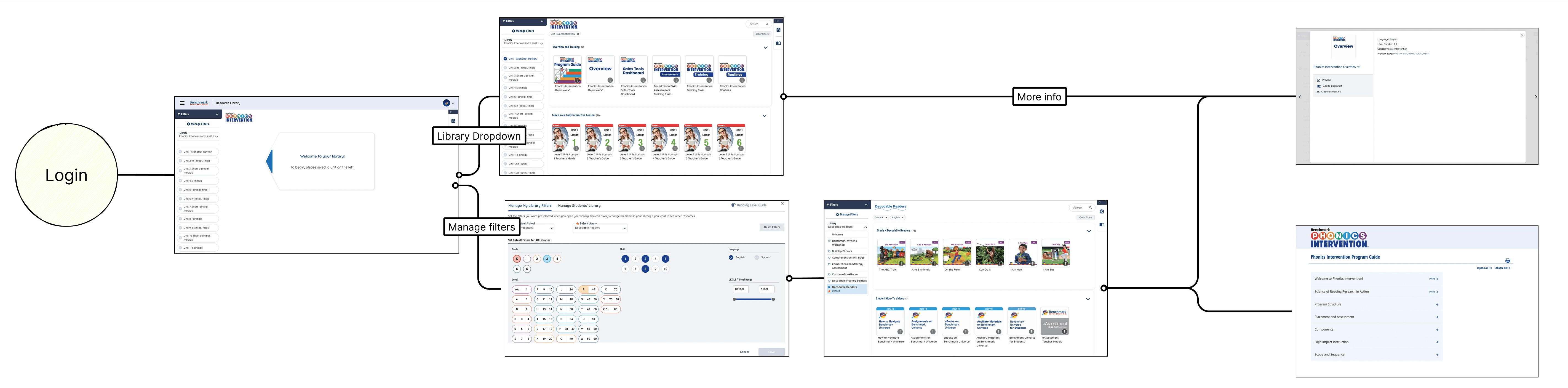
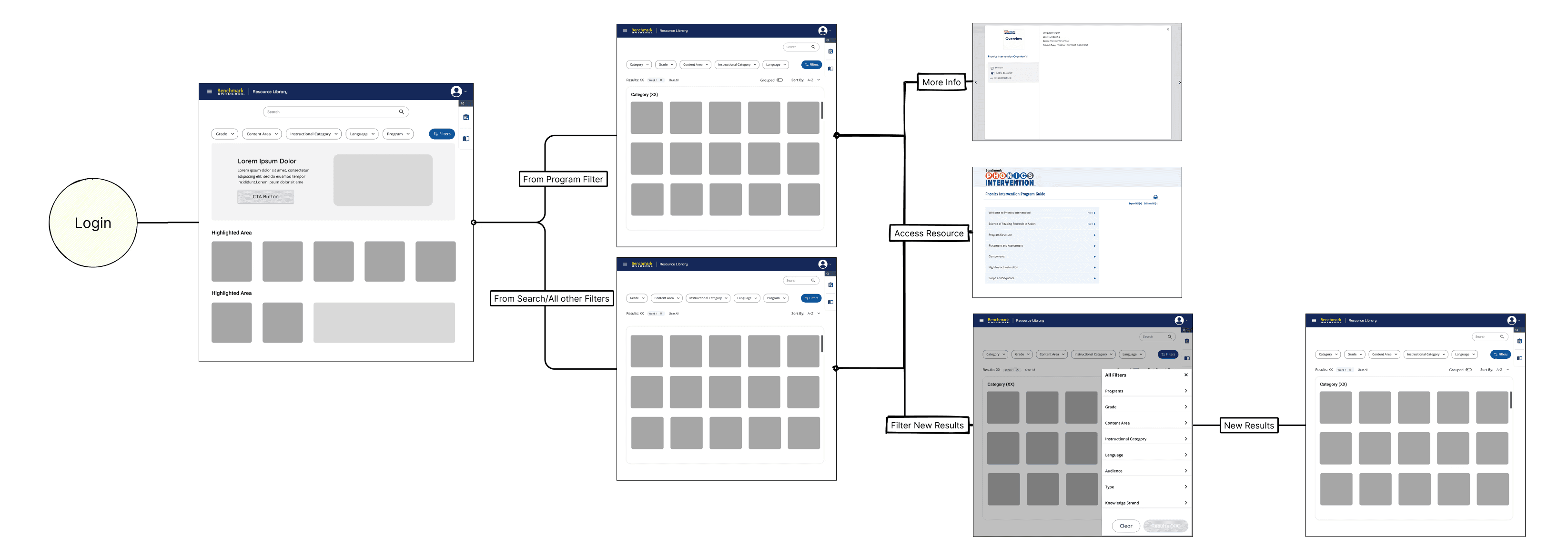
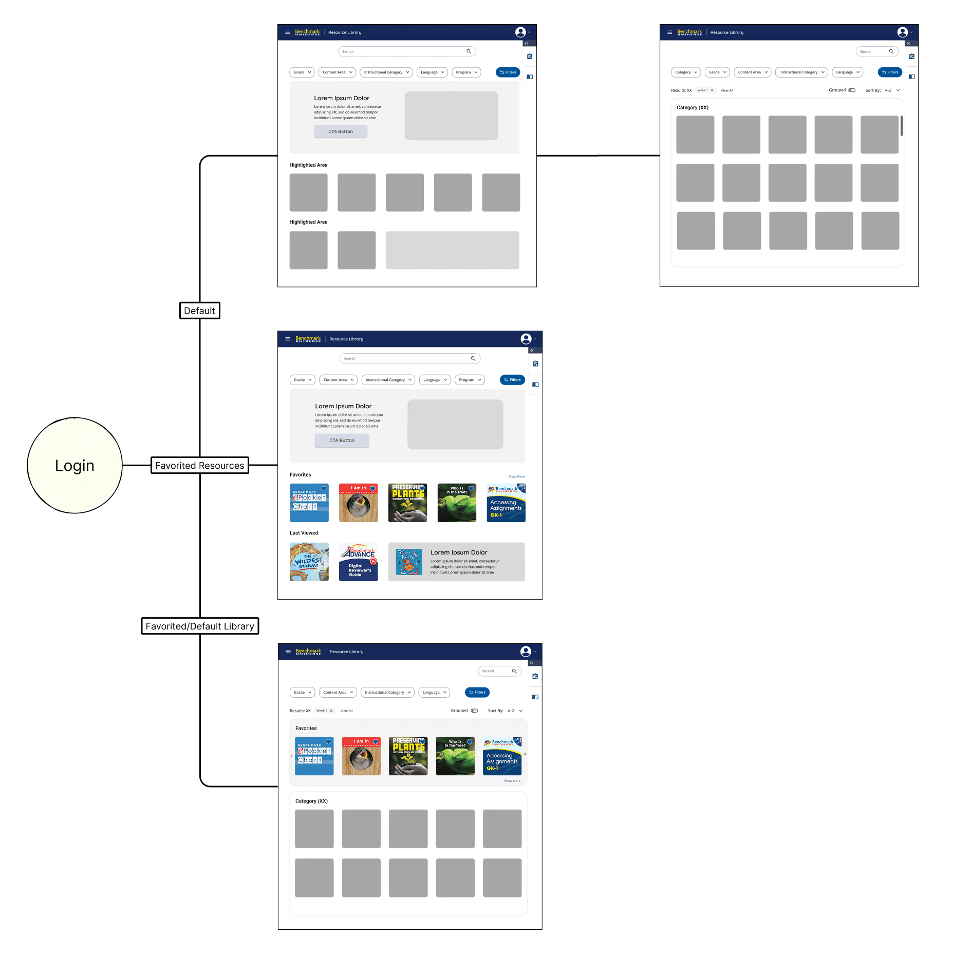
I mapped flows from the perspective of both first-time and returning users to understand their different needs and entry points. This allowed me to visualize the system and flow as whole to better strategize for each use case.
I mapped flows from the perspective of both first-time and returning users to understand their different needs and entry points. This allowed me to visualize the system and flow as whole to better strategize for each use case.
I mapped flows from the perspective of both first-time and returning users to understand their different needs and entry points. This allowed me to visualize the system and flow as whole to better strategize for each use case.
[Conflicting Stakeholder Decisions]
[Conflicting Stakeholder Decisions]
[Conflicting Stakeholder Decisions]
After receiving approval for card designs and sending it off to developers, stakeholders decided last-minute that the card design originally presented wasn't to their liking. Stakeholders wanted a more minimalistic and clean interface.
After receiving approval for card designs and sending it off to developers, stakeholders decided last-minute that the card design originally presented wasn't to their liking. Stakeholders wanted a more minimalistic and clean interface.
After receiving approval for card designs and sending it off to developers, stakeholders decided last-minute that the card design originally presented wasn't to their liking. Stakeholders wanted a more minimalistic and clean interface.
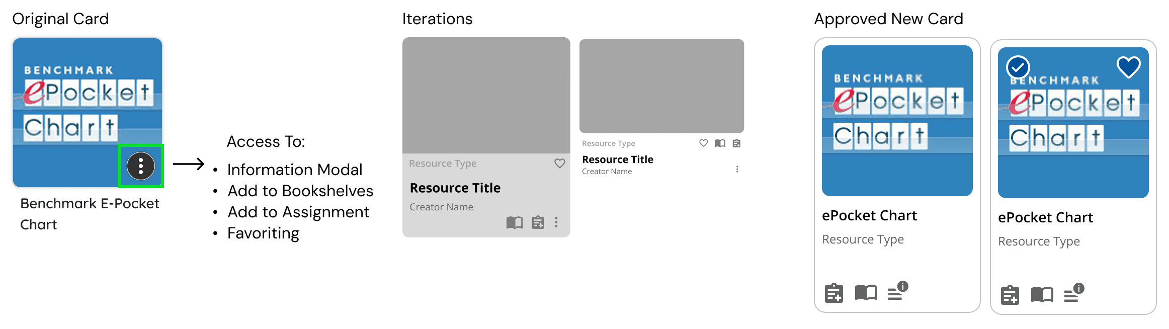
This resulted in multiple rounds of discussions and iterations to come to a final consensus on a new card design. This stalled development and required reprioritize of the tickets in the current sprint.
The new iteration showcased just the thumbnail and upon hovering all available features appeared. A tap-and-hold mechanic was built for mobile users.

[Design System & Accessibility Compliance]
[Design System & Accessibility Compliance]
Components were built on the existing design system, ensuring visual consistency while meeting WCAG 2.2 AA accessibility standards.
Tools must be accessible to students with disabilities, complying with Section 508 and Web Content Accessibility Guidelines to ensure equal education access.
Components were built on the existing design system, ensuring visual consistency while meeting WCAG 2.2 AA accessibility standards.
Tools must be accessible to students with disabilities, complying with Section 508 and Web Content Accessibility Guidelines to ensure equal education access.
Components were built on the existing design system, ensuring visual consistency while meeting WCAG 2.2 AA accessibility standards.
Tools must be accessible to students with disabilities, complying with Section 508 and Web Content Accessibility Guidelines to ensure equal education access.
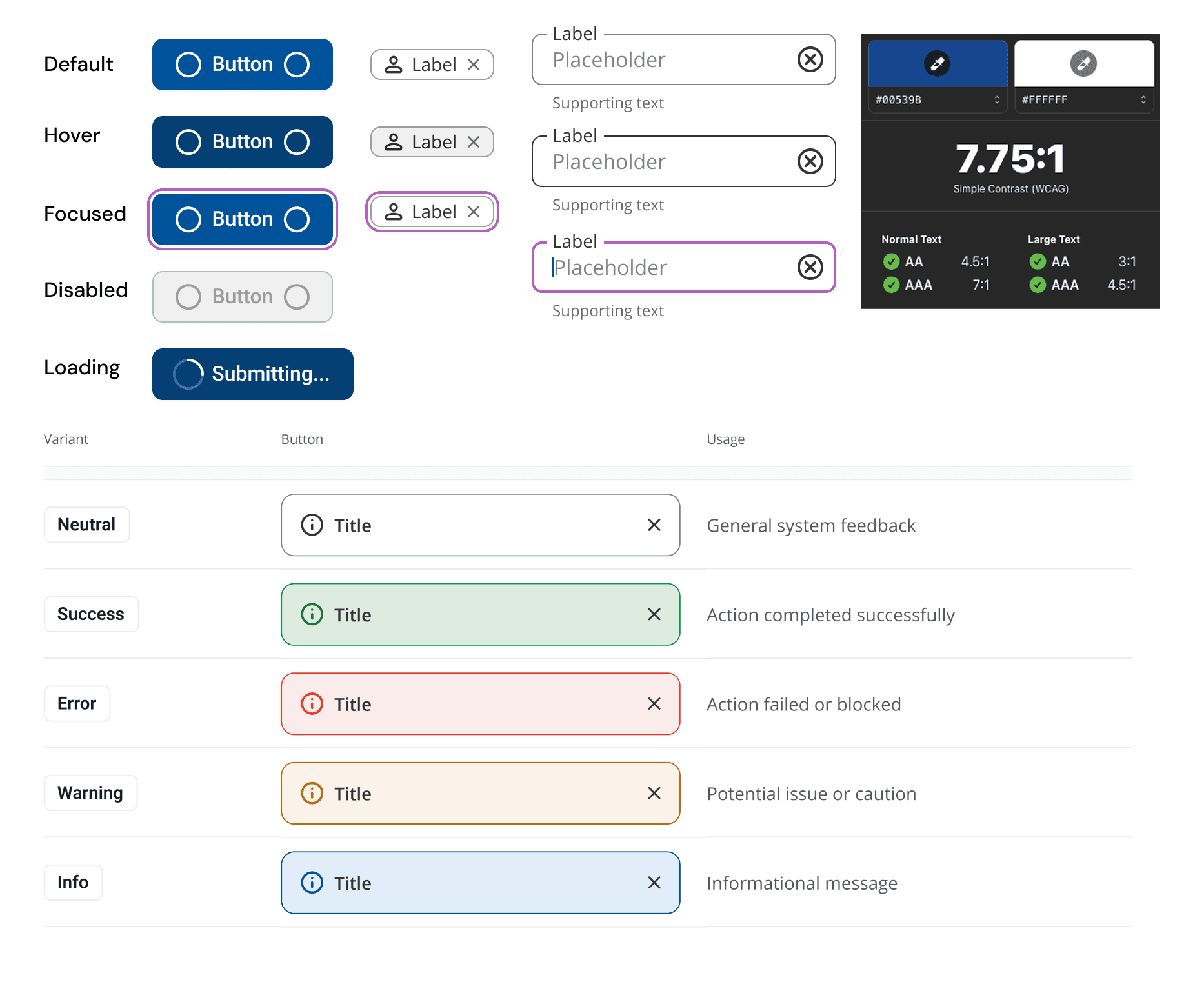
Considerations for: Color contrast, Alt Text for thumbnails, Keyboard Navigation, Screen Reader
Considerations for: Color contrast, Alt Text for thumbnails, Keyboard Navigation, Screen Reader
Considerations for: Color contrast, Alt Text for thumbnails, Keyboard Navigation, Screen Reader
[Key Features]
[Key Features]
[Key Features]
Filtering
Filtering
Filtering
A nested filtering system allows teachers to precisely narrow content by program, unit, grade, and content area , reducing search friction and surfacing relevant resources faster. The structured hierarchy also reinforced consistent metadata tagging on the backend, improving organization of content platform-wide.
A nested filtering system allows teachers to precisely narrow content by program, unit, grade, and content area , reducing search friction and surfacing relevant resources faster. The structured hierarchy also reinforced consistent metadata tagging on the backend, improving organization of content platform-wide.
A nested filtering system allows teachers to precisely narrow content by program, unit, grade, and content area , reducing search friction and surfacing relevant resources faster. The structured hierarchy also reinforced consistent metadata tagging on the backend, improving organization of content platform-wide.

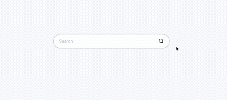
Enhanced Search
Enhanced Search
Enhanced Search
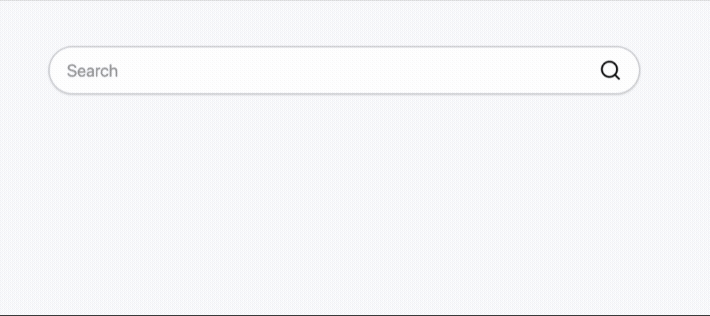
Search was a known pain point that I focused on due to users often becoming frustrated finding their desired content in a timely manner.
Key changes included adding autocomplete to increase engagement and reduce user friction, and contextual suggestions showcasing recent searches to allow immediate discovery.
Sections
Sections
Sections
Organized information into manageable, logical chunks, which improves scannability, navigation, and visual hierarchy. Each category encompassed a varied number of resources and users could access them through expandable states.
Organized information into manageable, logical chunks, which improves scannability, navigation, and visual hierarchy. Each category encompassed a varied number of resources and users could access them through expandable states.
Organized information into manageable, logical chunks, which improves scannability, navigation, and visual hierarchy. Each category encompassed a varied number of resources and users could access them through expandable states.

[Redefined MVP Launch]
[Redefined MVP Launch]
Due to further timeline and resource constraints, the initial MVP was rescoped to only card-level changes. By improving the core card component first, the team was able to ship meaningful improvements to all users immediately while laying the groundwork for future filter, navigation, and cross-program discovery updates.
Due to further timeline and resource constraints, the initial MVP was rescoped to only card-level changes. By improving the core card component first, the team was able to ship meaningful improvements to all users immediately while laying the groundwork for future filter, navigation, and cross-program discovery updates.
Due to further timeline and resource constraints, the initial MVP was rescoped to only card-level changes. By improving the core card component first, the team was able to ship meaningful improvements to all users immediately while laying the groundwork for future filter, navigation, and cross-program discovery updates.
[What's Next]
[What's Next]